Bubbles: a task manager that had to earn its download.
In 2019 a client asked us for one more task manager. It took five versions, one risky request and a single day of rework to give people a reason to install it, and a brand that talks like their own inner voice.
Build an app: the most common brief there is. At the first meeting we heard the words "task manager" and asked the obvious question: why another one? The answer was honest. The client had tried most productivity apps and still used pieces of each. So Bubbles had to live in a segment that did not exist yet.

Five versions in three months. We wrote the brief on paper and went straight to prototypes, and quickly saw the trap: we were promising to make someone more productive without knowing who. We mapped the audience, tested hypotheses on paper and kept cutting. An AI planner was feasible, but the goal was to reach the market, not to build machinery nobody had asked for. After the fifth version we handed everything to the client's analysts and stepped away for two weeks.
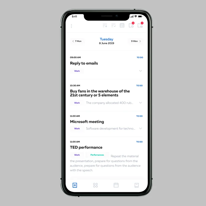
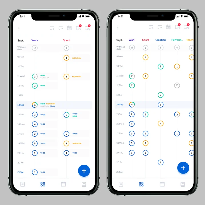
The data told us what to cut. It did not tell us why anyone would download it. Unless you were a productivity fan, there was no reason to install Bubbles, and that audience is small. By version 2.1 the product was 80% ready for development, and the client liked it. We asked for more time and budget anyway, with no hard numbers, only the feeling that the answer was close. The client took the risk with us.
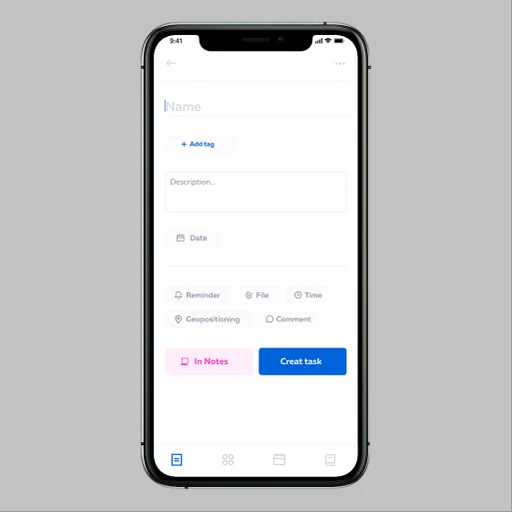
One day, 30% of the app. We went back to the logic we already had. It held, but it needed to be simpler. One hypothesis, one test version: in a single day it reworked 30% of the app. We walked into the next meeting knowing this was it, and the client saw it too.
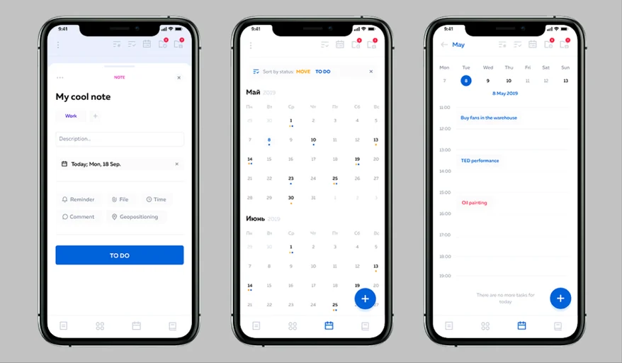
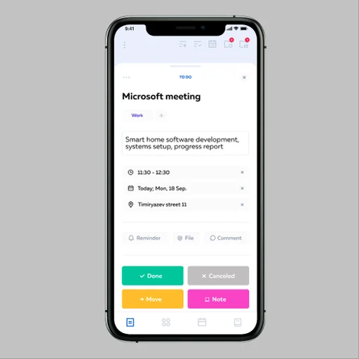
If the app saves your time, its ads should too.
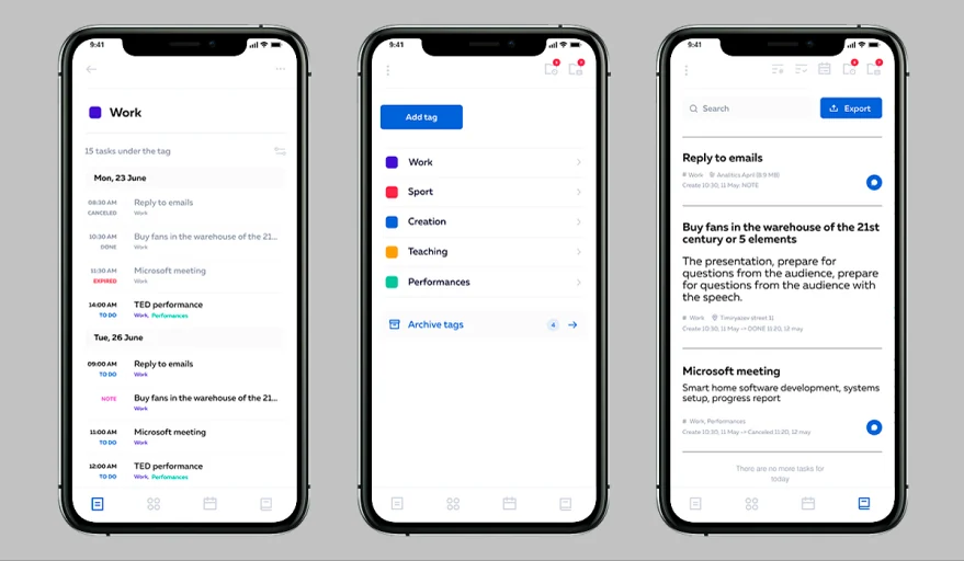
Then the brand. Time is the idea behind all of it. Whether you run a business or look after a child, an hour costs the same, and if Bubbles gives you back one minute a day, it has done its job. The product kept that promise with four ways to see your tasks and only one rule, tags. The brand kept it in words: short lines, a calm and motivating tone, a voice that sounds like your own.
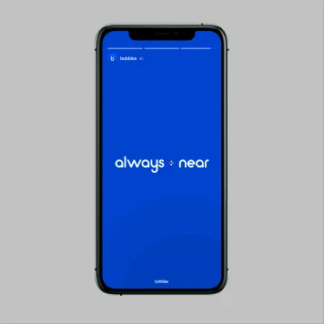
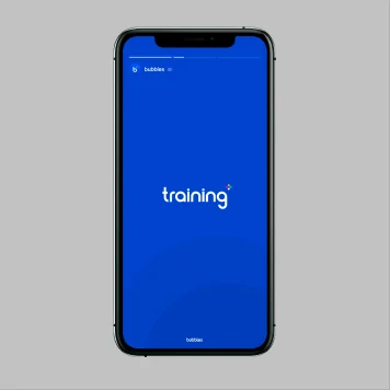
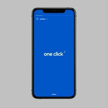
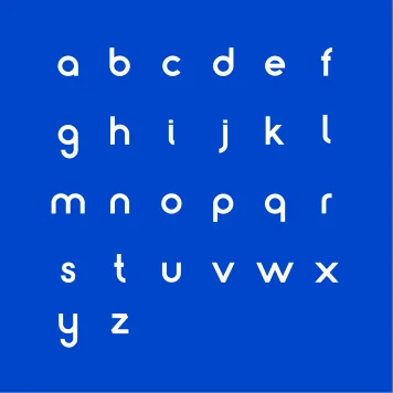
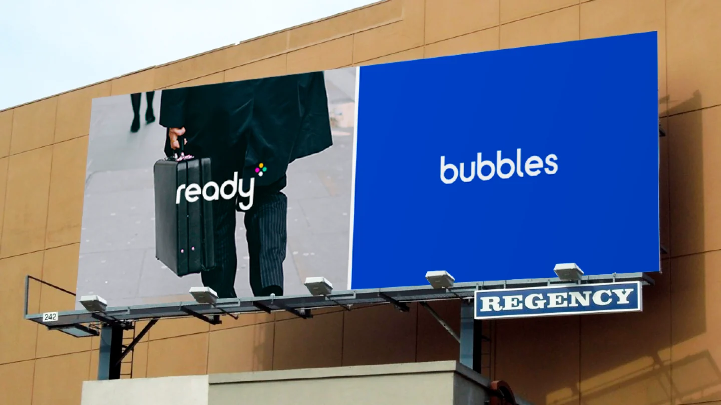
Activate the future. The campaign line was made to take that inner voice outside: billboards, stations, bus stops and stories, all in one blue and one typeface.
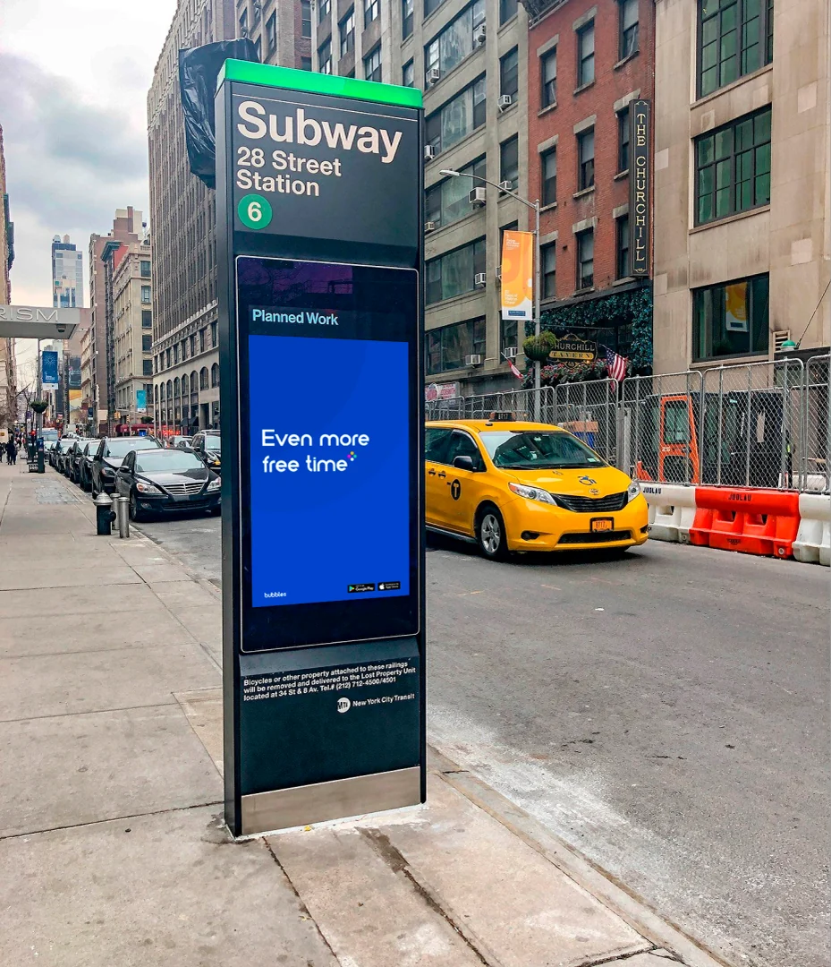
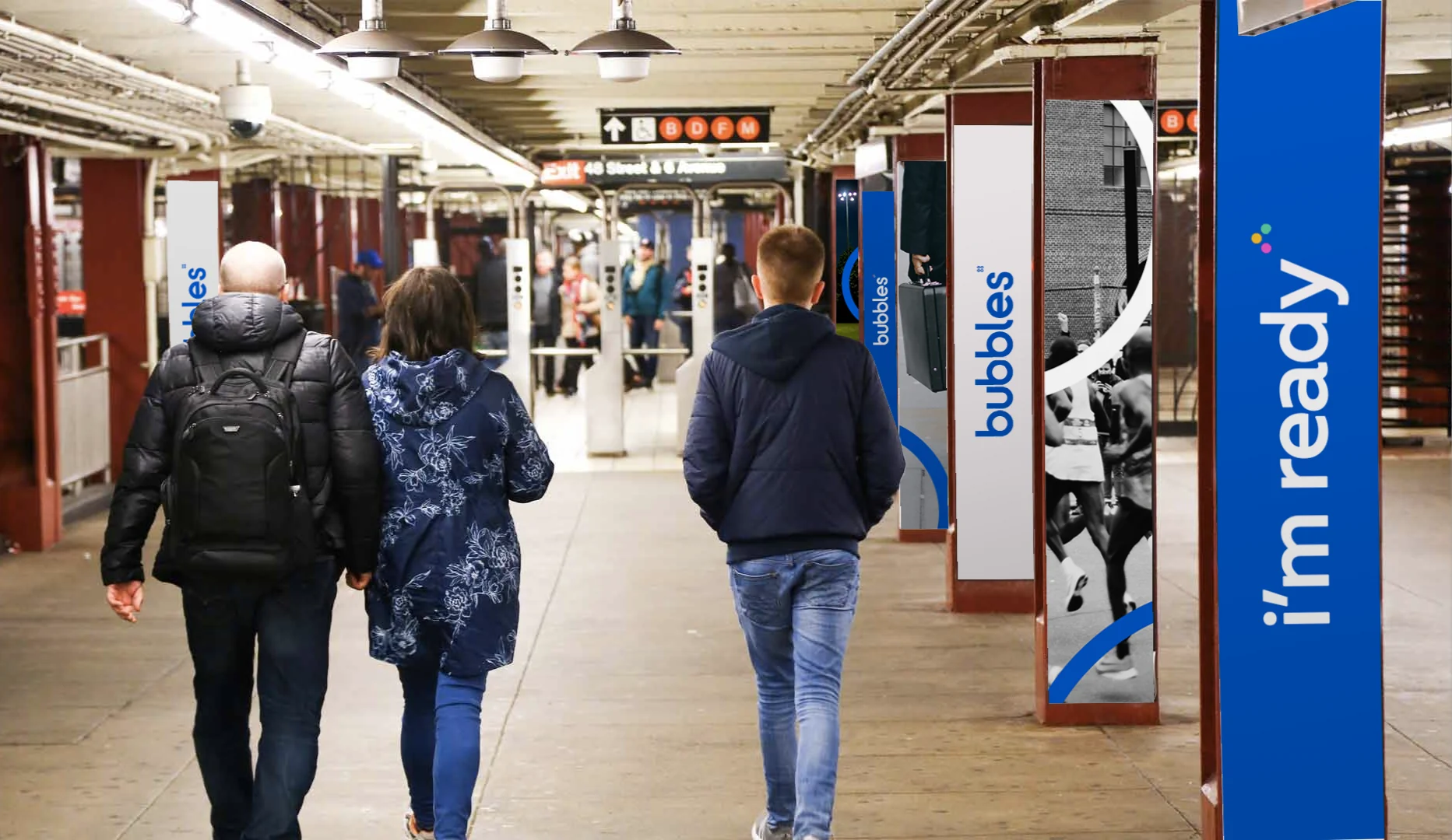
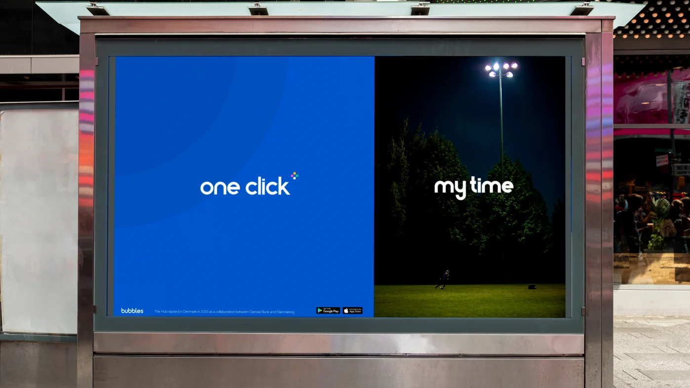

Short, calm, about time. Every piece of Bubbles had to pass those three words, from the task view to the poster on the street.